Thursday 18 December 2014

Evaluation - Question 4

How did you use the media technologies in the construction and research, planning and evaluation stages?

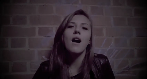
During our research, we used sources from the internet as a way of collecting in-depth information about music videos and how they're constructed. We also used a webcam from a computer, so that we could record interviews that we conducted about music videos, as a way of getting a general consensus of how our target audience views music videos, specifically in the punk rock genre.

As we began to plan for our music video, we used Windows Movie Maker to create a photographic storyboard, based on our original design. This helped us to get a better idea of what our music video would look like if we continued with those chosen shots. Our group also used a camera to film a short section of a song, so that we could get used to the filming stage of the production, in terms of how long it would take and how we could use the camera effectively. As a result, we then used that footage and transferred it to a 'Mac' computer so that we could edit it using the Movie Maker application. This meant we could not only practice using this software, playing around with filters etc, but also gain experience in lip syncing the video. These techniques are aspects we would later find essential to our final music video, and therefore this planning stage was very beneficial for us.


Once we had planned when we were going to film, we had decided what equipment we were going to use location. We selected a HD Panasonic camera to capture the footage, which gave our video a more visually professional appearance, and meant we could experiment with the depth of field effect, as we considered what was most important in our shots. Our group also chose to bring a dolly to the shoot of the performance shots, which meant we could create some steady establishing shots of our chosen artist. However, while filming we found that the uneven floor meant that the shots we'd attempted were shaky and lacked clarity. We therefore didn't end up using that particular footage in our final product, but at least it meant we were able to experiment with different pieces of technology on location. When we filmed the narrative shots, our group used a tri-pod instead of the dolly, as we wanted to keep the camera as still and in focus as possible to make it clear what was happening in the shots. The fact that the tripod extended meant we could try different shot heights, as a way of helping to establish a contrast in dominance and inferiority. For example, there's a shot in which the male character falls to the floor, and to highlight his lack of power we extended the height of the tripod so that the camera would be placed at a steeper angle, which we wouldn't have been able to achieve without this piece of equipment.


In the evaluation process, I wanted to use multiple ways of presenting my findings to create a sense of variety. For instance, I did a voice over of our final cut, talking about the product itself and the conventions it follows. I also did a 'Prezi' presentation, which I found effective at conveying information concisely and creating a distinctive visual style. I then proceeded to do a video blog, via a web cam, to talk about our audience feedback and how it impacted our work.


Evaluation - Question 3

What have you learned from you audience feedback?


Evaluation - Question 2

How effective is the combination of your main product and ancillary tasks?


http://prezi.com/bk8dsuy9x6wq/?utm_campaign=share&utm_medium=copy


This is a link to my prezi, as it failed to successfully embed into blogger directly.


Wednesday 17 December 2014

Evaluation - Question 1

In what ways does your media product use, develop or challenge forms and conventions of real media products?


Tuesday 11 November 2014

Cyanide - The Final Cut


This is the forth cut of our music video, and the finalised version, concluding our post-production process. Compared to our first cut, this video is noticeably more professional in its presentation and relates more strongly to legitimate examples from the punk rock genre.

Monday 10 November 2014

Final digipack


This is our finished digipack we made as an ancillary product of our music video. We link the two by displaying the two artists which were in the music video, to show a sense of consistency.

Sunday 9 November 2014

Final magazine advertisement


This is our finalised magazine advertisement, taking up half a page of A4 as a way of indicating that this is a niche band and doesn't necessarily have the popularity to equate to the same advertising space as a band such as King of Leon.

Wednesday 5 November 2014

2 x Plan for magazine advertisement

These are two designs I drew for our group's piece of magazine advertisement. Like with the digipacks, I chose to take two different approaches as a way of demonstrating how artists in the punk rock genre can be conveyed in several ways. The first advert, for example, is very simplistic, similar to the Kings of Leon advert I analysed previously, with this singular band member connoting solitude and loneliness. This would be very appropriate if the songs within the album in which the poster is advertising were based on such themes, establishing a target audience while also informing consumers as to what to expect from this particular product. In comparison, the second advert is structured more complexly, by displaying more information about the product, as well as presenting the band as more of a group, which has connotations of unity and friendship, contrasting from the previous design. With regards to colour, I would use quite dark shades for the background of the first design, to amplify that sense of solitude, while also making the artist the main focus of the poster. The pieces of text would therefore be white to create a strong contrast to the background, which could also suggest that the band are a symbol of hope within this darkness, presenting them as quite hopeful. For the second design, I would use a brick wall with graffiti on it to incorporate the idea of rebelling, and create an opportunity to use vibrant/passionate colours, such as red and green, to demonstrate the musical range the band has. This exercise has helped me to consider the different ways in which artists can be advertised, and also think about how the song that we've chosen to do fits in with these representations.  


Sunday 19 October 2014

Analysis of magazine advertisment from our chosen genre

This piece of advertisement is representing the punk rock band Green Day, showcasing their new song 'Wake me up when September ends,' which suggests it's a popular single and they're using that to help publicise their new album. As a way of getting the information across quickly and efficiently, the bottom half of the advert is displaying the band's newest songs on one side and the album which audiences can find them on the right hand side. This helps people to associate contemporary songs they like with a way of listening to them all in one convenient place, embedding the idea that if you like the song at the top and/or left hand side you should buy the product on the right. In terms of typography, this advertisement uses a wide variety of fonts as a way of grouping pieces of information together. For example, the two headlines at the bottom are identical due to the previously mentioned association of products. In comparison the name of the band uses a bigger and more distinctive font at the top of the page as a way of standing out amongst the other pieces of text. They way the picture of the singer is positioned could suggest that he is looking directly at the title, creating a connection between the artist and the iconography of the band itself. By contrast, the font of the new single 'Wake me up when September ends' is significantly less sophisticated and appears handwritten. This could suggest that the song has some sentimental value to the band, incorporating a more personal approach to music. The sharpness of the font also has connotations of aggression and violence, which are stereotypical themes that are associated with the punk rock genre and therefore implies that theses themes are elaborated on in the content that they are trying to publicise. 

This analysis has helped to give me some ideas, in terms of how our advert should be structured (such as the framing of shots and typography), so that it fits within the punk rock genre and audiences respond with that in mind.

Thursday 16 October 2014

2 x Plan for digipack


These are two designs I drew for what our digipack for our chosen artist could look like, taking elements from other examples in the punk rock genre, such as the jagged font from the My Chemical Romance album to connote aggression. The two designs contrast one another, in terms of the mood and tone they create. While the first one contains a naturalistic setting and a band member juxtaposing that with a melancholy expression, the second is set out like a piece of evidence, with the front cover containing a fingerprint, a knife and a cyanide pill, as a way of relating to the songs in which the album contains. In terms of colour, I would use very subtle tones like green and yellow for the first digipack, as a way of relating to the naturalistic atmosphere that had been established through the setting of a field. This has positive connotations and therefore presents the band in a more approachable manner, which could result in a wider target audience. By contrast, I would use a dark shade of grey as the dominant colour in the second digipack, as the way I've laid it out is a lot more clinical and detached than the previous design. This digipack also strongly relates to the element of crime, with there being various weapons on the front and a prison mugshot on the back. The combination of this design and colour results in more negative connotations, with the band now being conveyed as somewhat rebellious and daring. This exercise has helped to prepare us for what the next part of the course entails, as well as give us a chance to be creative, when it comes to how we think the artist could be presented and decide what is the best way to identify the genre of music.

Analysis of a digipack from the punk rock genre


This is a digipack for a CD album by the band 'My Chemical Romance.' Considering they are from the same genre as our chosen artist, it's interesting to see what stereotypical elements they've incorporated as a way of appealing to their target audience. For example, what's first noticeable about this is the distinct lack of colour, with the contrast of the white and black shading conveying a sense of detachment. This may be referring to the band having a lack of emotional attachment, becoming a stereotypical representation of the male gender being more masculine and less obviously open about their emotions. 
 
The band's name on the front of the digipack is the most eye-catching piece of text, with it being in the centre of the frame and also having the biggest font size. The font itself has connotations of aggression and violence, linking to themes that are usually associated with the punk rock genre, and implying that these same themes are covered in the songs within the album. By contrast, the name of the digipack album is significantly smaller and more subtle in its font type. This suggests that they want the band to be the main focus of this product because it is more likely to attract consumers, with a mainstream band or artist being able to sell a lot more copies if their name is physically attached to the product.


Typically, the back of the digipack contains a barcode in the corner and a list of the album's songs. What's striking about this is that the layout of the songs resembles that of a historical Texan wanted poster. This choice in font therefore connotes quite a rebellious nature, relating back to the stereotypically masculine representation of the band as well as suggesting that they live by their own rules and therefore possibly defy the conventions of the punk rock genre, thus making their music more original.


The picture on the front of the album is quite abstract, however it seems that it's an establishing shot of a crowd looking at a stage in an ecstatic manner. This is another way in which the product is implicating that the band is somewhat mainstream in the music industry and conveys them as having a large fan base. Below the bands name is drops of some kind of liquid and, because the digipack lacks colour, we can deduce that they could be blood drops, creating links to the Gothic lifestyle as well as establishing a darker, more adult tone, and therefore narrowing down their target audience. Similarly, in the corner there is a bold piece of text which states 'parental advisement explicit content.' This is evidence of their more grown up target audience, while also relating back to the concept of rebelling.


Looking at this digipack has helped us to think about the kind of mood and tone we want to establish with our digipack and how that will link into our target audience. It has also made us consider how we make our digipack distinctive and stand out amongst others trying to accomplish the same task: selling their product.

Pitch idea based on lyrics

Each member of our group was given a printed copy of the lyrics to the song 'Cyanide' by The Fake Imposters, in which we will be basing our music video around. We chose this song because it's one of the band's original songs and we thought the lyrics created a good opportunity for a narrative-based music video. Individually, we annotated the lyrics constructing possible concepts that we could incorporate into our video to make it appear more professional and artistic. This exercise helped us to map out ideas and compare what each other had come up with to see if there were any similarities that we were certain would fit into the criteria of our genre and artist. Below is my annotations to the lyrics and what I thought would work in regards to our video:


Wednesday 15 October 2014

Lyric analysis and their importance


This is an analysis of the lyrics to the Evanescence song 'My Immortal,' and my interpretation of how I think it could be conveyed in a music video, disregarding my previous knowledge of the artist and basing it purely on the lyrical content. Andrew Goodwin's theory can be applied in this instance, with myself addressing the connection between the lyrics and the possible visuals of the video while also paying particular attention to the structure of the lyrics and how they portray a sense of narrative through their connotations. For example, in the first verse it states 'suppressed by all my childish fears.' I thought this could be visually represented in the video by having a high-angle midshot of a child hiding, as a result of the negative language within the lyrics and therefore addressing the correlation of the lyrics and visuals within Goodwin's theory. This exercise has helped me to apply Goodwin's theory to real world texts, consider the connotations of lyrics and how they could impact music videos.


Monday 13 October 2014

2 x Magazine advertisement analysis

This is a an advert publicising the artist Lana Del Rey and her new album 'Born To Die.' The soft focus of the camera relates to a more retro tone, which suggests her music is similarly less contemporary and more reflective of an earlier time period. In correlation, her clothing and hair are typical of the 1920s fashion style, thus having connotations of sophistication and a subtle rebellious nature. Blue is a dominant colour in this picture, contrasted by the white of the font and the artist's shirt. This contrast could have links to the variety of songs within the album, implicating that each  deals with different themes, as blue connotes coolness, while white has links with purity and innocence. The direct mode of address from the artist makes the advert seem as though she is looking right at you and therefore conveys the advert as more personal. In terms of text, the most striking is the name of the artist at the top, as the size of it is large and the font is very easy to read. This suggests that this is the information that people should pay the most attention to, and therefore indicating that this artist is well known in the music industry - otherwise the public would just disregard the advert. The fact that the name of the album is placed directly on top of the artist's chest could imply that this album is closed to her heart and as a result is something she's very passionate about.


In comparison, this advert for the band Friendly Fires uses different construction techniques, which suggests they're part of a different genre to Lana Del Rey. While the top advert shows the artist using direct mode of address, this band are all looking away from the camera. The fact that they're all looking in different directions could suggest that the songs in the album are similarly diverse. The colours are also more vibrant, with the palm trees and beach setting implying that the music is quite peaceful and conveys an upbeat mood and tone. By using the header 'the band of the summer,' Friendly Fires are presenting themselves as very much mainstream. Based on the age of the band members and having a cocktail drink as a prop, the advert is indicating that the band's target audience is young adults, most likely females considering that is a stereotypical association with boy bands. 

This analysis has helped put into perspective as to how different music genres are represented in advertisements and that the colour and typography play a big part in the indication of what audiences can expect from the album, in regards to the mood and tone.

2 x Digipack analysis


This is a CD case (digipack) of an ACDC album. The genre of the album is apparent through the use of colour, with the combination of red and black having quite negative and sinister connotations, such as blood and death. In correlation, the font is very big and aggressive, which is clear in the spikes on each of the letters. These visual codes suggests that the band is some part of some form of rock or heavy metal. On the back all the song names are listed to inform the consumer of what this product contains, as well as a billing block at the bottom to give credit to all who were involved in the production of the music. What's interesting about the digipack's design is that the inside contains a light blue colour which is very contrasting from the colours used on the outside, with the accompanying connotations being equally positive in comparison, having links to water and sky. This contrast implies that the songs within the pack are more diverse than the outside design leads consumers to believe, or at the very least makes the red and black stand out more as dominant colours and exaggerates the darkness within the music.


In comparison, this digipack of a Rihanna album appeals to a different target audience as a result of it's genre being pop instead of heavy metal. Pink appears to be a dominant colour in this pack, whether it's the colour of the flower on the right or even the pink filter that's been used to convey the artist. This highlights her femininity, while the picture in the middle relates to Laura Mulvey's male gaze theory by showing the consumer what the males are most likely to look at in regards to this artist's physique. The direct mode of address makes the album feel more intimate for the consumer, as it appears that the artist is looking right at them in a flirtatious manner. What's intriguing is that although both digipacks use the colour red, both have different connotations because they use it in a different context, which is a good example of each genre having their own stereotypical conventions. The fact that the Rihanna pictures also have a softer focus means that consumers instinctively make a connection between the soft lens conveying the artist as less threatening  and the red having connections to romance and love. By contrast, the ACDC red is used in a sharper way, by being used with the black, as well as being a stronger shade.

I have looked at these 2 digipacks because we have to make our own to go along with our music video and so this task has helped me to analyse any trends that are apparent within a wide range of albums, such as dominant colours and how genders are represented through visual aids.

Friday 10 October 2014

Digipack, magazine adertisments and their importance


A digipack is a cover used to contain a CD album of an artist. This helps to keep the contents safe, as well as convey the artist or band in a way that fits in with their chosen genre, while trying to make them stand out amongst other musicians through eye catching visual codes, like contrasting colours and iconic fonts.


This is a piece of poster advertisement, which you would normally find in a music magazine, with a lot of mainstream artists, such as Jessie J, utilising this type of media text to help publicise themselves. By apply this advert to a music magazine they are appealing to their target audience of music enthusiasts. If this was to be in a film magazine, less people would pay attention to this advert because it's not designed with them in mind.

To summarise, a digipack is the product that the magazine advertisement is promoting, with both helping to make the artist or band more well known in the music industry.

Thursday 9 October 2014

Notes on The Cultural Effects theory and how it applies to music videos

‘The cultural effects’ theory is a way of explaining the effects of media on audiences. More specifically, ‘The cultural effects’ theory regards the evolving effect of media on audiences and how it is not drastically impacting but more so builds up over time. The process is slow and very much gradual. This relates, and can be used in correlation, to Marxism, which is the concept that society dictates our actions and how we feel compelled to meet certain social expectations throughout our lives. This theory links because it relates to a lack of control over audiences, with the effect of the media not even being immediately noticeable. The more consistent an idea becomes in the media industry, then the more likely it is to be accepted by citizens, referring to market trends, such as the pop genre being the most socially common.

An example of this can be seen in the current trend in pop music videos being very explicit and grown up in content. This has sparked controversy and resulted in parental advisories at the beginning of selected music videos, such as Iggy Azalea's song 'Fancy.' This demonstrates an effect of music videos which has built up until it has become too extreme to ignore.


We will refer to this theory by following contemporary trends within the punk rock genre, such as the element of rebellion via a setting containing graffiti and the passion behind the lyrical content being visually presented through the performance shots of the artists.

Wednesday 8 October 2014

Lip syncing - what it is and its importance

Lip syncing regards the editing technique in which you apply the element of sound to filmed footage. Because songs are designed to be memorable and 'catchy,' the actual song itself is recorded separately in a professional studio, in order to make the music the best it can be, in terms of quality. This means that the footage doesn't actually contain music and the actors or artists in it are just miming. As a result, it's important that the music and footage are synchronized perfectly to incorporate verisimilitude and make it seem as though they actually are singing the song.

Below is an example of both good and bad lip syncing to demonstrate how important this aspect is when applied to a music video:


Friday 3 October 2014

Analysis of 2 music videos from our chosen genre

Green day - 'Boulevard Of Broken Dreams'

Camera

This music video appears to use a distinct filter at multiple moments throughout, giving it quite a retro feel, which works well with the rural setting. It also connotes a gritty and dark atmosphere, relating to the punk rock genre incorporating similar themes across a majority of songs. This seems to be applied in correlation with close ups of the singer of the band, implying that he's similarly aggressive and gritty as the filter leads the audience to believe.


Typically for this genre, there are also numerous establishing shots of the band performing to showcase their talent. This helps to publicise the band and put a face to the music, while also making the song more personal by intertwining the performance with the narrative.


Another common element in this video is the use of tracking shots, with the lyrics relating to walking down lonely roads. This not only links to Goodwin's theory of there being a connection between the lyrics and visuals but also embeds the idea that the band are the main focus of the video by the camera following their movements as they change location.


Mise-en-scene

The settings for this music video are a desert, an old warehouse and a high street. This diversity gives the video better pacing and makes it more interesting to watch, as well as creates more of a narrative structure, connoting a sense of progression, considering a high street is a more luxurious location compared to a dessert road.


As you can see above, the video uses a mixture of lighting conditions, referring to the lyrical content and it's emotional darkness as well as the upbeat chorus and it's lighter connotations.  The costumes are very dark, with black being a dominant colour and having connotations of death, which points the band to being quite Gothic.


When it comes to props, typical band equipment is seen throughout the video, such as microphones and guitars. This helps to identify the genre and use Green day's mainstream status to promote brand names for the instruments. For example, Ibanez is quite a well known and expensive guitar make and therefore it's logical that they could be used in a music video such as this to connote a high level of quality for the music while also publicising the brand as a product.


Editing

This music video is structured as a concept and performance-based piece, with the concept fragments relating to the lyrics and conveying the band as somewhat melancholy, while this is consistently balanced by performance shots, with the band acting more energetic and passionate about their music. Discontinuous editing is used throughout, with it starting off slow paced, as shots last several seconds, which for a music video is quite long. However, when the music begins, the shots are immediately quicker, as they're in time with the drum beat, creating more of a direct connection between the video and the music.

Sound

Because this music video is primarily performance-based, the only diegetic sound is the introduction to the video, in which the band's car breaks down with a faint radio playing in the background. Interestingly, the radio song is a piece of instrumental that relates to the punk rock genre that this band is a part of, quickly establishing a mood and tone that is reflected in the rest of the video.


Kings Of Leon - 'Sex on fire'

Camera

At the beginning of the video, as the instrumental comes in, there are multiple extreme close ups of the singer of the band. The agitated movement in the shot connotes a sense of paranoia and relates to the lyrical content, such as 'I know they're watching,' which, much like the Green day video, demonstrates Goodwin's theory being applied to real world texts.


Much like the previous band, the video also contains a lot of performance shots, which in this case also informs the audience that the singer is a part of the narrative.


There also appears to be a distinction in power within the use of camera, with a lot of the singer's shots being at a high angle and conveying him as inferior, while other members of the band are represented as more masculine and aggressive, reflecting the tone of the song.


Mise-en-scene

There is only one setting in this music video, despite it being constructed around both and narrative and performance. The old warehouse gives the music video a more gritty atmosphere and relates back to the discomfort that derived from the paranoia.


Low key lighting is used throughout, creating a more adult tone and portraying the band as quite enigmatic by having them hide in the shadows. As you can see in the pictures above, the costumes in this music video consists of quite basic clothing, incorporating verisimilitude by wearing something the general public are used to seeing. The black clothes connote death and depression, which also refers back to the themes apparent in the lyrics. When compared to the previous band, it's clear that this style of clothing and colour is consistent throughout the punk rock genre.

In terms of props, the most obvious appearances are those of the band's instruments, however there is also a black bird in several shots. This could relate to the animalistic nature of the band, with the passion of the performance being the main focus of the video.


Editing

The editing is fast paced, with shots being very quick and giving the music video better pacing. Discontinuous editing is used throughout, with the scenes alternating from the narrative of the paranoid man and the band performing. By constantly switching back and forth it's clear that there is a connection between the two scenes, when it comes to the topics they cover and in this case the people in it.

Sound

There is no diegetic sound in this music video, which suggests that the band wanted the audience to focus on the musical element and less on the narrative, but the fact that they even put one in there implies there is some kind of message or symbolic moral to be taken away from the video.


Analysing these 2 videos has helped me to determine patterns within the punk rock genre and I will take this on board as our group constructs our own music video, across all 4 technical areas.